Websites & web apps
We build websites, online stores and custom web applications for your business.
Extreme Mountains travel company website
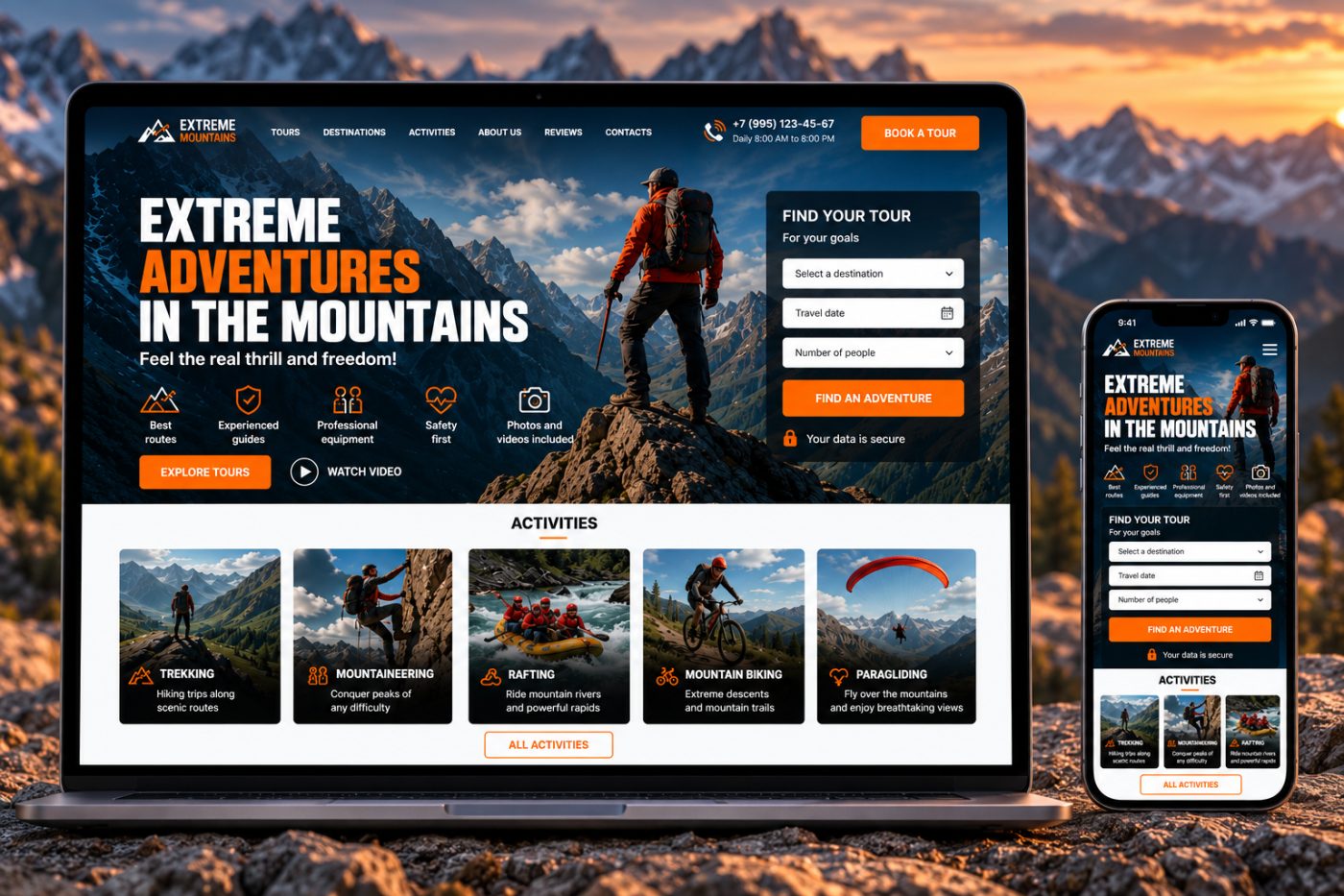
We were tasked with creating a modern, sales-oriented website for a company that organizes extreme and adventure tours in the mountains. The main emphasis was to be placed on the visual presentation of routes, the emotions of travel, and convenient selection of a suitable tour.
The website was intended to simultaneously serve as a presentation of the travel destination, a tour catalog, and a tool for receiving customer inquiries.
What Challenges Did We Address?
Difficulty Conveying the Emotions of Travel
Simply displaying a list of routes is not enough for a travel product. Users need to immediately experience the atmosphere of the mountains, the scale of the journey, and the level of adventure on offer.
A Wide Range of Destinations
The company offers various types of outdoor activities: trekking, mountaineering, rafting, mountain biking, and paragliding. We needed to present them within a unified structure without overwhelming users with information.
Choosing the Right Tour
When selecting a trip, customers need to consider the destination, travel date, and number of participants. We therefore incorporated these parameters directly into the website's main user journey.
Clearly Communicating the Company's Advantages
Users need to understand immediately what sets the company apart from other travel organizers: the guides' experience, safety standards, equipment, and personalized approach.
Generating Inquiries
The website needed to do more than describe tours. It had to guide users toward a specific action — selecting a route or submitting an inquiry.
What We Delivered
We developed a complete landing page for the travel company, featuring an activity catalog, popular tours, company advantages, customer reviews, and a trip selection form.
Hero Section
The first screen immediately immerses users in the atmosphere of extreme outdoor adventures and highlights the company's main advantages. It also features a quick way to find a suitable tour.
Tour Selection
Users can select a destination, travel date, and number of participants, then proceed to find a suitable offer.
Activity Catalog
The main activities are presented in separate cards: trekking, mountaineering, rafting, mountain biking, and paragliding.
Popular Tours
A dedicated section showcases the most popular routes, providing information about duration, difficulty, price, and options for viewing detailed descriptions.
Company Advantages
A dedicated section highlights the company's key strengths: tour organization experience, professional guides, safety, a personalized approach, and memorable travel experiences.
Inquiry Form
At the bottom of the website, users can submit a request for a suitable trip without spending time searching for options themselves.
Customer Reviews
A dedicated section features customer reviews, showcasing the real experiences of travelers and helping build trust in the company.
Contact Information
The company's contact details, phone number, email address, and physical address are presented in a separate section for easy access.
How We Structured the Website
We designed the page as a step-by-step user journey, taking visitors from their first impression to submitting an inquiry.
User journey: first impression → activity selection → popular tours → company advantages → reviews → inquiry
Main user flow: destination → date → number of participants → tour selection → details → inquiry
This structure allows users to explore the available offers independently or proceed directly to finding a suitable trip.
Key Project Elements
Hero Section
A large visual section featuring an atmospheric mountain photograph immediately establishes an emotional connection with the brand and sets the tone for the entire website.
Tour Selection Form
This interactive section allows users to specify the main parameters of their upcoming trip and use them to find a suitable offer.
Activity Cards
Each activity has its own card with an image, a short description, and a clear link to more detailed information.
Tour Cards
The cards display the key details of each trip: name, duration, difficulty, and price.
Advantages Section
Concise content blocks quickly explain why users should consider this particular travel company.
Call to Action
The CTA section at the bottom of the page directs users back to the primary action — selecting and booking a trip.
Why We Chose This Approach
A travel website should sell not only a specific route but also the anticipation and excitement of the upcoming journey.
That's why the visual design revolves around large photographs of mountains, outdoor activities, and people experiencing their adventures. At the same time, the informational sections remain compact enough to help users move quickly from inspiration to a specific offer.
We also avoided overwhelming the first screen with too much information. The main advantages and activities are introduced progressively, while the most important action — finding a suitable tour — is available immediately.
A good travel website should first inspire people to embark on an adventure and then make it as easy as possible to understand how to do it.
What the Client Received
- A modern website for a travel company.
- An engaging, visually striking hero section.
- A form for selecting suitable tours.
- An activity and destination catalog.
- A catalog of popular tours.
- Route cards featuring key information.
- A company advantages section.
- Customer reviews.
- An inquiry submission form.
- A contact information section.
- A clear user journey.
- A consistent visual identity for the travel brand.
The result was more than just an informational website. It became a complete landing page for a travel company, combining an emotionally engaging presentation of travel experiences with a catalog of offers and a clear path to submitting an inquiry.
Our Approach
In projects like this, we aim to combine visual design with the website's business objectives. For a travel company, this means doing more than showcasing beautiful photographs — it means guiding users from their first impression to a specific action.
That's why we brought together immersive visuals, a destination catalog, popular tours, company advantages, and inquiry tools within a single, cohesive structure.
VERIDIAN — Technical Apparel E-commerce
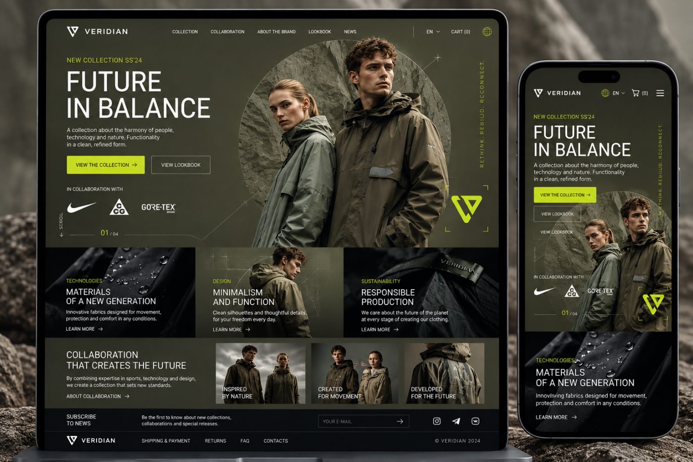
A digital platform for a contemporary apparel brand, combining e-commerce, collection showcases, and brand storytelling.
The goal was to create a digital storefront for a modern functional apparel brand, combining product aesthetics with a seamless online shopping experience. Rather than simply presenting a product catalogue, the website needed to communicate the brand's identity through visual storytelling, collection presentation, and intuitive navigation.
We developed an e-commerce concept built around minimalism, technology, and the relationship between people and nature. The visual identity combines deep natural tones, expressive typography, large-scale photography, and distinctive lime-green accents.
Project Overview
The Challenge
A modern fashion brand needs more than a conventional product catalogue. Its website must make a strong first impression, communicate the brand philosophy, showcase collections, and guide visitors from initial discovery to purchase.
The challenge was to combine the commercial functionality of an online store with a distinctive visual concept inspired by contemporary technical apparel brands.
Communicating the Brand Identity
The interface needed to reflect the combination of functionality, minimalism, and contemporary design. Every visual element had to contribute to brand recognition and create a consistent impression of the collection.
Making Collections the Centrepiece
Products and complete looks needed to take centre stage. Large photographs, carefully considered compositions, and concise copy help present each garment as part of a unified design concept.
Combining E-commerce with Brand Storytelling
Beyond the product catalogue, the website needed to introduce visitors to material technologies, design principles, brand collaborations, and sustainable production practices.
Creating a Seamless Mobile Experience
The website had to preserve its visual impact and usability across different screen sizes, allowing customers to explore collections and navigate the store comfortably on mobile devices.
What We Created
We developed an e-commerce homepage concept that combines commercial functionality with the editorial presentation of a contemporary fashion brand.
Collection Hero Section
The opening screen introduces the latest collection through large-scale model photography, a bold headline, and a concise description of the collection concept. The primary calls to action provide direct access to the collection and lookbook.
Store Navigation
The main navigation provides access to collections, collaborations, brand information, the lookbook, and news. Additional controls allow visitors to change the language and access the shopping cart.
Showcasing Materials and Technologies
Dedicated content blocks highlight the brand's core principles: advanced materials, minimalist design, and responsible production. Photography, concise descriptions, and links to further information turn the homepage into a comprehensive brand presentation.
Brand Collaborations
A dedicated section presents collaborations with other brands and industry partners. Visual cards showcase joint projects and communicate different aspects of VERIDIAN's philosophy.
Newsletter and Customer Engagement
The lower section of the homepage features a newsletter subscription for updates on new collections, collaborations, and special releases. The footer provides access to shipping and payment information, returns, FAQs, and contact details.
Visual Concept
Natural Tones with Technical Accents
The design is built around a palette of graphite, olive, and deep green tones. Lime green provides contrast across buttons, navigation highlights, and brand graphics.
Expressive Typography
Large headlines play a central role in the composition and establish the character of the page. Concise supporting copy complements the photography without competing with it, maintaining a balance between information and visual storytelling.
Photography as Part of the Interface
Images of models, fabric textures, and garment details are integrated directly into the page structure. Rather than serving as simple illustrations, they form an essential part of the brand's visual narrative.
Editorial Page Structure
The homepage unfolds as a sequence of visual stories: the collection introduction, material technologies, design philosophy, and brand collaborations. This approach allows visitors to explore the brand without overwhelming them with information.
Responsive Design
The mobile experience was designed specifically for smaller screens. Navigation becomes more compact, content is arranged vertically, and key controls remain accessible.
The mobile layout retains the website's visual identity, including its dark palette, expressive typography, lime-green accents, and prominent collection imagery.
Key Features
- Homepage showcasing the latest collection
- Navigation across the brand's main sections
- Direct access to collections and the lookbook
- Dedicated sections for materials, technologies, and design
- Brand collaboration showcases
- Newsletter subscription and promotional updates
- Informational footer with essential customer links
- Responsive layouts for mobile devices
Our Design Approach
Fashion e-commerce requires a careful balance between brand expression and commercial objectives. An overly functional interface can feel generic, while excessive decoration can interfere with navigation and product discovery.
We therefore made the collection the focal point of the experience. Large photographs create an emotional connection, typography establishes the brand's character, and clearly positioned navigation and calls to action provide a straightforward path to the products.
The result is a website concept that feels less like a conventional clothing catalogue and more like a complete digital brand experience.
Result
We created a visual concept for the VERIDIAN e-commerce website, bringing together collection presentation, brand storytelling, and key customer touchpoints.
The concept features a distinctive dark interface, recognisable colour accents, a carefully structured homepage, and a responsive mobile layout.
Project Type: Fashion E-commerce · Clothing Store · Responsive Web Design
Alexey Vorontsov — Psychologist & Gestalt Therapist
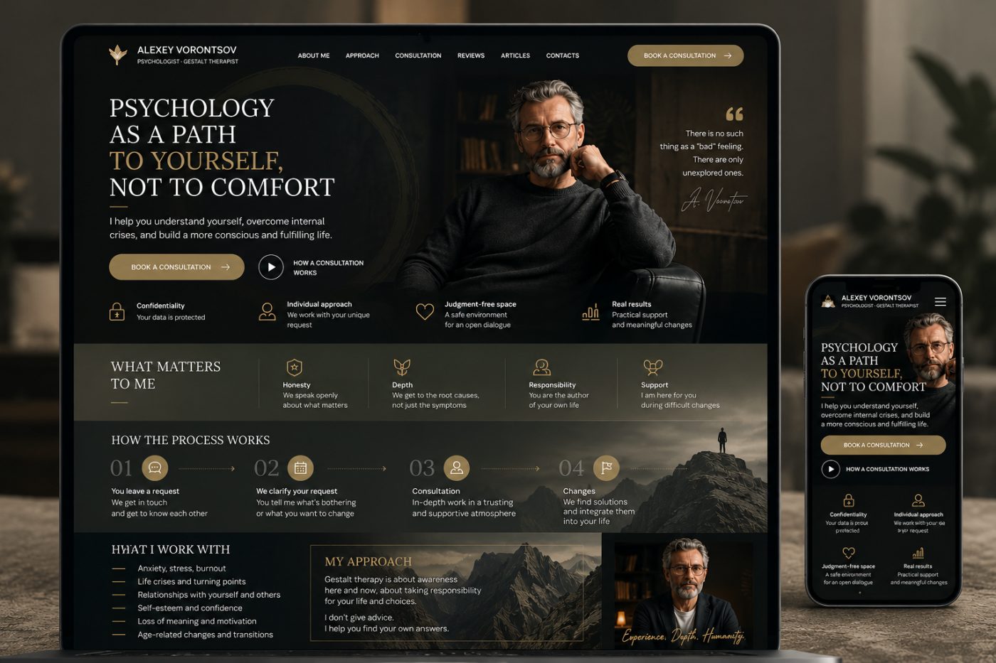
A personal website for a psychologist, designed to communicate trust, present a therapeutic approach, and make booking a consultation straightforward.
The goal was to create a digital space that reflects the personality and professional approach of a psychologist and Gestalt therapist. The website needed to introduce the specialist, explain how therapy works, and help visitors take the first step toward a consultation in a calm and supportive environment.
We developed a visual concept built around understated elegance, warm natural tones, cinematic photography, and refined typography. The design communicates professionalism and depth without feeling clinical or impersonal.
Project Overview
The Challenge
Choosing a psychologist is a personal decision that requires trust and a clear understanding of the specialist's approach. Visitors need more than a list of services: they want to understand who the therapist is, what the process involves, and whether the environment feels right for them.
The challenge was to create a website that combines a strong personal identity with clear information architecture, helping visitors explore the therapist's philosophy and move naturally toward booking a consultation.
Building Trust Through Design
The visual identity needed to communicate warmth, confidence, and professionalism. We used restrained colours, carefully composed photography, and a clear typographic hierarchy to create a welcoming and thoughtful atmosphere.
Explaining the Therapeutic Approach
Gestalt therapy can be unfamiliar to potential clients. The website needed to explain the specialist's approach in accessible language, helping visitors understand the principles behind the work and what they could expect from the process.
Making Consultation Booking Accessible
Booking a consultation needed to remain one of the most visible actions throughout the experience. Clear calls to action allow visitors to move from exploring the website to considering the next step without unnecessary friction.
Creating a Comfortable Mobile Experience
The website needed to retain its visual character and readability on smaller screens, ensuring that visitors could explore the specialist's profile, understand the approach, and access consultation information from their smartphones.
What We Created
We developed a website concept that combines a personal introduction, an explanation of the therapeutic process, the specialist's professional values, and clear consultation entry points.
Hero Section and Personal Introduction
The opening screen introduces Alexey Vorontsov as a psychologist and Gestalt therapist. A prominent headline communicates the central idea of the practice: understanding yourself rather than simply seeking comfort.
A concise introduction explains the purpose of the work, while prominent consultation buttons provide a direct path to the next step. A portrait of the specialist adds a personal dimension and helps establish an immediate connection with the visitor.
Core Principles and Values
A dedicated section presents the principles behind the therapeutic approach, including honesty, depth, responsibility, and support. Each value is accompanied by a short explanation, allowing visitors to understand the philosophy of the practice at a glance.
A Clear Overview of the Therapeutic Process
We structured the process into four stages: initial contact, clarification of the client's needs, consultation, and working toward meaningful changes.
This visual sequence helps visitors understand how the process unfolds and reduces uncertainty about what happens after making the first contact.
Areas of Practice
A dedicated section highlights the issues the specialist works with, including anxiety, stress, burnout, life transitions, relationship difficulties, self-esteem, loss of motivation, and age-related changes.
The structured presentation makes it easier for visitors to identify relevant areas and determine whether the specialist's practice aligns with their needs.
Personal Therapeutic Approach
The approach section introduces the principles of Gestalt therapy, with an emphasis on awareness, personal responsibility, and understanding individual choices.
Rather than presenting therapy as a set of ready-made solutions, the content communicates a collaborative process in which clients develop a deeper understanding of themselves and find their own answers.
Consultation Information
Consultation booking is integrated into the page structure through clearly visible calls to action. An additional entry point introduces visitors to the consultation process, helping them understand what to expect before getting in touch.
Visual Concept
A Refined Dark Palette
The visual identity is based on deep charcoal, black, warm brown, and muted olive tones. Gold accents highlight important interface elements and add a subtle sense of sophistication without overwhelming the content.
Expressive Typography
Elegant serif headlines create a distinctive editorial character, while clean sans-serif body text ensures readability. This combination balances the emotional depth of the subject with the clarity expected from a professional website.
Photography and Atmosphere
Portrait photography plays a central role in the design. The specialist's image is integrated into the composition alongside dark interiors and mountain landscapes, reinforcing the themes of reflection, personal growth, and finding direction.
Structured Content and Visual Hierarchy
The page is organised into clearly defined sections, each addressing a specific question a potential client may have. Short descriptions, restrained iconography, and consistent spacing help visitors navigate the content without feeling overwhelmed.
Responsive Design
We designed a mobile layout that adapts the desktop concept to smaller screens while preserving its visual identity.
Navigation becomes more compact, content is reorganised into a vertical sequence, and consultation actions remain easy to access. Typography, imagery, and spacing are adapted to maintain readability and a consistent user experience across devices.
Key Features
- Personal introduction and professional profile
- Prominent consultation booking calls to action
- Overview of the Gestalt therapy approach
- Presentation of professional values and principles
- Step-by-step explanation of the therapeutic process
- Structured overview of areas of practice
- Dedicated section explaining the specialist's approach
- Navigation to reviews, articles, and contact information
- Responsive layouts for desktop and mobile devices
Our Design Approach
A psychologist's website requires a careful balance between professional credibility and emotional accessibility. An overly formal design can feel distant, while an overly decorative interface can distract from the specialist and the information visitors need.
We therefore built the visual concept around the specialist's personality and therapeutic philosophy. Photography establishes a personal connection, typography creates a calm editorial atmosphere, and a clear content structure helps visitors understand the process before making contact.
The result is a digital presence designed to communicate not only professional expertise, but also the values and principles that shape the therapeutic relationship.
Result
We created a website concept for Alexey Vorontsov that combines personal branding, professional information, and consultation entry points in a cohesive digital experience.
The design features a distinctive dark aesthetic, warm gold accents, expressive typography, atmospheric photography, a clearly structured presentation of the therapeutic process, and an adaptive mobile layout.
LogiPro — Logistics Management Platform
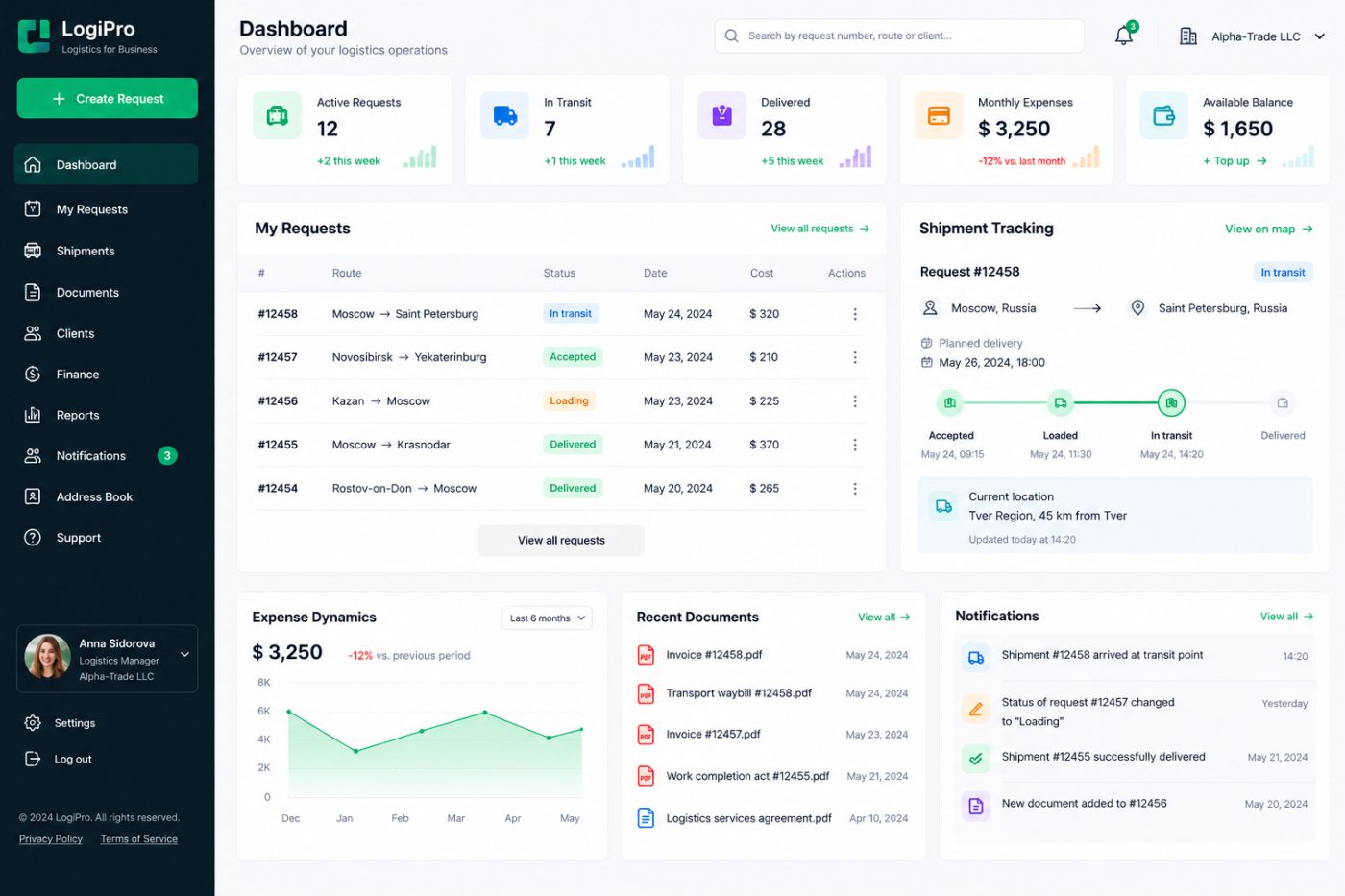
A digital platform for managing logistics requests, tracking shipments, handling documents, and monitoring transportation expenses in one workspace.
The goal was to create a unified logistics management platform that gives businesses a clear overview of their transportation operations. The system needed to bring shipment requests, delivery statuses, financial information, documents, and client data together in one place.
We developed a dashboard concept focused on operational visibility, efficient request management, and real-time access to shipment information. The interface combines a structured workspace, clear status indicators, visual analytics, and shipment tracking tools to help teams manage logistics processes more efficiently.
Project Overview
The Challenge
Logistics operations involve multiple interconnected processes, from creating transportation requests and coordinating shipments to managing documents, monitoring expenses, and confirming deliveries.
When these activities are handled through disconnected tools, it becomes harder to track shipment progress, control costs, and keep all participants informed. The objective was to bring these processes into a single digital environment with a clear overview of daily operations.
Managing Multiple Transportation Requests
Logistics teams need to monitor numerous shipments simultaneously, each with its own route, status, delivery date, and transportation cost. A structured request management system makes it easier to review active operations and identify requests that require attention.
Tracking Shipment Progress
Knowing the current status and location of a shipment is essential for coordinating deliveries. The platform needed to present shipment milestones, planned delivery dates, and current location information in an accessible format.
Controlling Transportation Expenses
Transportation costs need to be visible alongside operational information. Financial indicators and expense analytics help businesses monitor spending, compare periods, and understand changes in logistics expenditure.
Centralising Documents and Communication
Invoices, transport waybills, service agreements, and delivery notifications are essential parts of logistics operations. The platform needed to provide convenient access to documents and keep important updates visible within the same workspace.
What We Created
We developed a logistics dashboard concept that brings together shipment management, tracking, financial monitoring, documents, and notifications in a single interface.
Operational Dashboard
The main dashboard provides an overview of the company's logistics activity through key indicators, including active requests, shipments in transit, completed deliveries, monthly expenses, and available balance.
These metrics help users understand the current operational situation without navigating through multiple sections of the platform.
Transportation Request Management
The request table displays essential information about each shipment, including its reference number, route, current status, scheduled date, and transportation cost.
Colour-coded status indicators distinguish accepted requests, shipments being loaded, deliveries in transit, and completed orders. This makes the current state of each request easy to identify.
Shipment Tracking
A dedicated tracking panel presents the selected shipment's route, origin, destination, planned delivery date, and current status.
The shipment timeline visualises key milestones, from acceptance and loading to transit and final delivery. A current-location panel provides additional information about the shipment's latest reported position.
Expense Analytics
The expense analytics section visualises transportation spending over time. A line chart makes it easier to identify changes in expenditure and compare the current period with previous results.
Combined with the monthly expense indicator, this section provides a concise overview of the financial side of logistics operations.
Document Management
The recent documents panel provides quick access to essential logistics files, including invoices, transport waybills, completion certificates, and service agreements.
Document names and dates are displayed in a structured list, allowing users to locate recently added files without leaving the main workspace.
Notifications and Operational Updates
The notification centre collects important events, including shipment arrivals at transit points, request status changes, completed deliveries, and newly added documents.
This helps users stay informed about ongoing operations and quickly identify events that may require further action.
Client and Company Management
The platform includes dedicated navigation for clients and company information, providing a foundation for organising business relationships and managing logistics operations within a corporate account.
Financial Overview
The financial section highlights monthly expenses and the available account balance. The interface also provides a visible entry point for balance top-ups, keeping key financial information accessible alongside transportation activity.
Visual Concept
Clean, Business-Oriented Interface
The design combines a light background with a dark teal navigation sidebar. This contrast separates primary navigation from the main workspace while maintaining a professional, modern appearance.
Colour-Coded Status Indicators
Green, blue, orange, and purple accents distinguish different categories of information, including shipment statuses, financial metrics, documents, and notifications. These visual cues help users interpret operational data quickly.
Information Hierarchy
The dashboard is organised into clear functional areas. Key metrics appear at the top, followed by request management and shipment tracking, with analytics, documents, and notifications positioned below.
This structure prioritises frequently used information and reduces the effort required to navigate between operational tasks.
Data Visualisation
Charts, progress indicators, status labels, and shipment timelines transform operational data into information that can be understood at a glance. The visual elements complement the underlying records rather than overwhelming the interface.
Responsive Design
The interface concept is designed around a structured desktop workspace, where users can review several operational panels simultaneously.
The layout can be adapted for smaller screens by prioritising essential shipment information, simplifying navigation, and reorganising dashboard components into a vertical sequence. This approach supports convenient access to logistics information from different devices.
Key Features
- Centralised logistics operations dashboard
- Transportation request management
- Shipment status monitoring
- Route and delivery tracking
- Shipment milestone timeline
- Transportation expense analytics
- Available balance overview
- Centralised access to logistics documents
- Operational notifications and status updates
- Client and company management sections
- Account settings and support navigation
- Interface concept adaptable to mobile devices
Our Design Approach
Logistics software needs to make complex operational information easy to understand. Users must be able to identify active shipments, check delivery progress, review documents, and monitor expenses without unnecessary navigation.
We therefore organised the interface around the daily workflow of a logistics team. Key metrics provide an immediate overview, the request table supports day-to-day operations, the tracking panel highlights shipment progress, and the lower dashboard sections provide access to financial analytics, documents, and notifications.
The result is a cohesive interface concept in which operational visibility and straightforward navigation take priority.
Result
We created a dashboard concept for LogiPro that brings together the essential components of a logistics management platform: transportation requests, shipment tracking, financial monitoring, document access, and operational notifications.
The design features a structured business interface, clear status indicators, data visualisation, and a modular dashboard layout intended to make logistics operations easier to monitor and manage.
Project Type: Logistics Management Platform · Transportation Tracking · Business Dashboard · UI/UX Design
Tow Truck Service — Roadside Assistance in Karelia
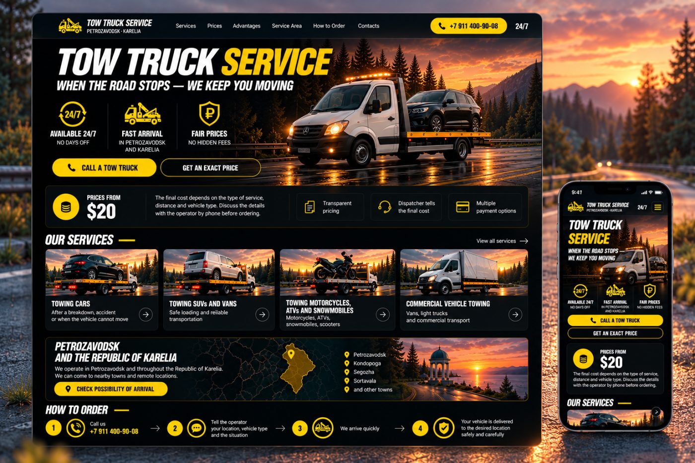
A service website for a towing company providing 24/7 vehicle recovery and transportation in Petrozavodsk and across the Republic of Karelia.
The goal was to create a high-impact website that helps drivers quickly find the right towing service, understand the pricing approach, and contact an operator without unnecessary steps.
We developed a bold visual concept built around automotive photography, a black-and-yellow colour palette, prominent call-to-action buttons, and clearly structured service information. The design communicates reliability, speed, and availability at any time of day.
Project Overview
The Challenge
When a vehicle breaks down or an accident occurs, drivers need assistance quickly. They should be able to identify the available services, understand how to request a tow truck, and contact the company with minimal effort.
The website needed to combine a strong visual identity with practical functionality, making essential information immediately accessible on both desktop and mobile devices.
Making Emergency Assistance Accessible
The phone number and call-to-action buttons needed to remain highly visible throughout the experience. Visitors should be able to contact the company immediately rather than search through multiple pages.
Presenting Services Clearly
The company provides transportation for different types of vehicles, including passenger cars, SUVs, vans, motorcycles, and commercial vehicles. The website needed to communicate these service categories clearly and help customers identify the appropriate option.
Building Trust Through Transparent Pricing
Potential customers need a clear understanding of how towing costs are determined. The interface highlights starting prices, explains the factors affecting the final cost, and encourages customers to request an exact quote from an operator.
Communicating the Service Area
Customers need to know whether assistance is available at their location. The website highlights Petrozavodsk and the wider Republic of Karelia, presenting the service area alongside a dedicated arrival availability inquiry.
What We Created
We developed a website concept that combines service presentation, direct contact options, pricing information, geographic coverage, and a simple ordering process.
Hero Section
The opening screen features a large automotive scene with a tow truck transporting a vehicle against a dramatic evening landscape. A bold headline communicates the service immediately, supported by a concise message about keeping drivers moving when the road stops.
Three key benefits — 24/7 availability, fast arrival, and fair pricing — are presented directly below the headline. Prominent buttons allow visitors to call for assistance or request an exact price.
Pricing and Service Transparency
A dedicated pricing panel introduces the starting price and explains that the final cost depends on the type of service, distance, and vehicle.
Additional information highlights transparent pricing, confirmation of the final cost by the dispatcher, and available payment options. This helps establish clear expectations before the customer places an order.
Service Catalogue
The services section presents the company's main towing categories through visual cards with dedicated photography and concise descriptions.
- Car Towing: Transportation after breakdowns, accidents, or situations in which a vehicle cannot move independently.
- SUV and Van Towing: Safe loading and transportation for larger passenger vehicles and vans.
- Motorcycle, ATV, and Snowmobile Towing: Specialised transportation for motorcycles, all-terrain vehicles, snowmobiles, and scooters.
- Commercial Vehicle Towing: Transportation solutions for vans, light trucks, and commercial vehicles.
Each card provides a clear entry point to the relevant service, making it easier for visitors to identify the assistance they need.
Geographic Coverage
A dedicated section introduces the company's operating area across Petrozavodsk and the Republic of Karelia.
The composition combines regional map graphics, location markers, and a landscape photograph. Key locations include Petrozavodsk, Kondopoga, Segezha, Sortavala, and surrounding towns.
A prominent call to action allows customers to check the possibility of arrival at their location.
How to Order a Tow Truck
We presented the ordering process as a simple four-step sequence:
- Call the company. Contact the operator using the prominently displayed phone number.
- Describe the situation. Provide your location, vehicle type, and details of the problem.
- Wait for assistance. The service arranges the appropriate vehicle and dispatches a tow truck.
- Complete the transportation. Your vehicle is delivered to the agreed destination.
This structured presentation helps visitors understand what happens after the initial call and reduces uncertainty during a stressful situation.
24/7 Availability
Round-the-clock availability is one of the central messages of the website. The design reinforces this promise through repeated availability indicators, prominent contact details, and a dedicated emphasis on emergency assistance.
Visual Concept
Black and Yellow Identity
The design combines a deep black background with vivid yellow accents. Yellow is used for primary buttons, icons, phone numbers, and key interface elements, creating strong contrast and supporting quick visual recognition.
Automotive Photography
Large, cinematic images of tow trucks, passenger vehicles, and road environments establish the context immediately. The photography communicates the nature of the service without relying on lengthy explanations.
Bold Typography
Heavy, condensed headlines give the website an energetic automotive character. Supporting text uses a simpler typographic style to maintain readability across service descriptions, pricing information, and navigation elements.
Conversion-Focused Layout
The page prioritises the information most relevant to a potential customer: the available services, starting prices, service area, and phone number. Clearly differentiated content blocks allow visitors to scan the page and move directly to the appropriate action.
Responsive Design
The website concept includes a dedicated mobile presentation designed around the needs of drivers accessing the service from their smartphones.
The mobile layout prioritises the company identity, service headline, phone number, main benefits, and contact buttons. Content is reorganised vertically to keep the most important information accessible on smaller screens.
This approach supports a straightforward mobile experience, particularly when customers need to contact a towing service quickly.
Key Features
- High-impact homepage with a clear service proposition
- Prominent telephone contact and towing request buttons
- 24/7 service availability messaging
- Dedicated towing service categories
- Starting-price presentation and pricing information
- Explanation of factors affecting the final cost
- Regional service area presentation
- Location-based arrival availability inquiry
- Four-step ordering process
- Responsive desktop and mobile layouts
Our Design Approach
A towing service website serves a practical purpose: helping people find assistance when they need it. The design must communicate the service immediately, establish confidence, and make contacting the company as straightforward as possible.
We therefore built the interface around three priorities: visibility, clarity, and action. Strong contrast makes important elements easy to find, service cards simplify the choice of assistance, and prominent telephone buttons provide a direct path to the operator.
The combination of cinematic automotive imagery and a structured information layout gives the website a distinctive visual identity while keeping its primary purpose clear.
Result
We created a website concept for Tow Truck Service that brings together service presentation, pricing information, geographic coverage, and a straightforward ordering process.
The design features a distinctive black-and-yellow visual identity, prominent contact elements, dedicated service categories, a regional coverage section, and a mobile-first approach to essential customer actions.
Project Type: Service Business Website · Towing & Roadside Assistance · Lead Generation · Responsive Web Design
Pizza Delivery — Online Pizza Ordering Store
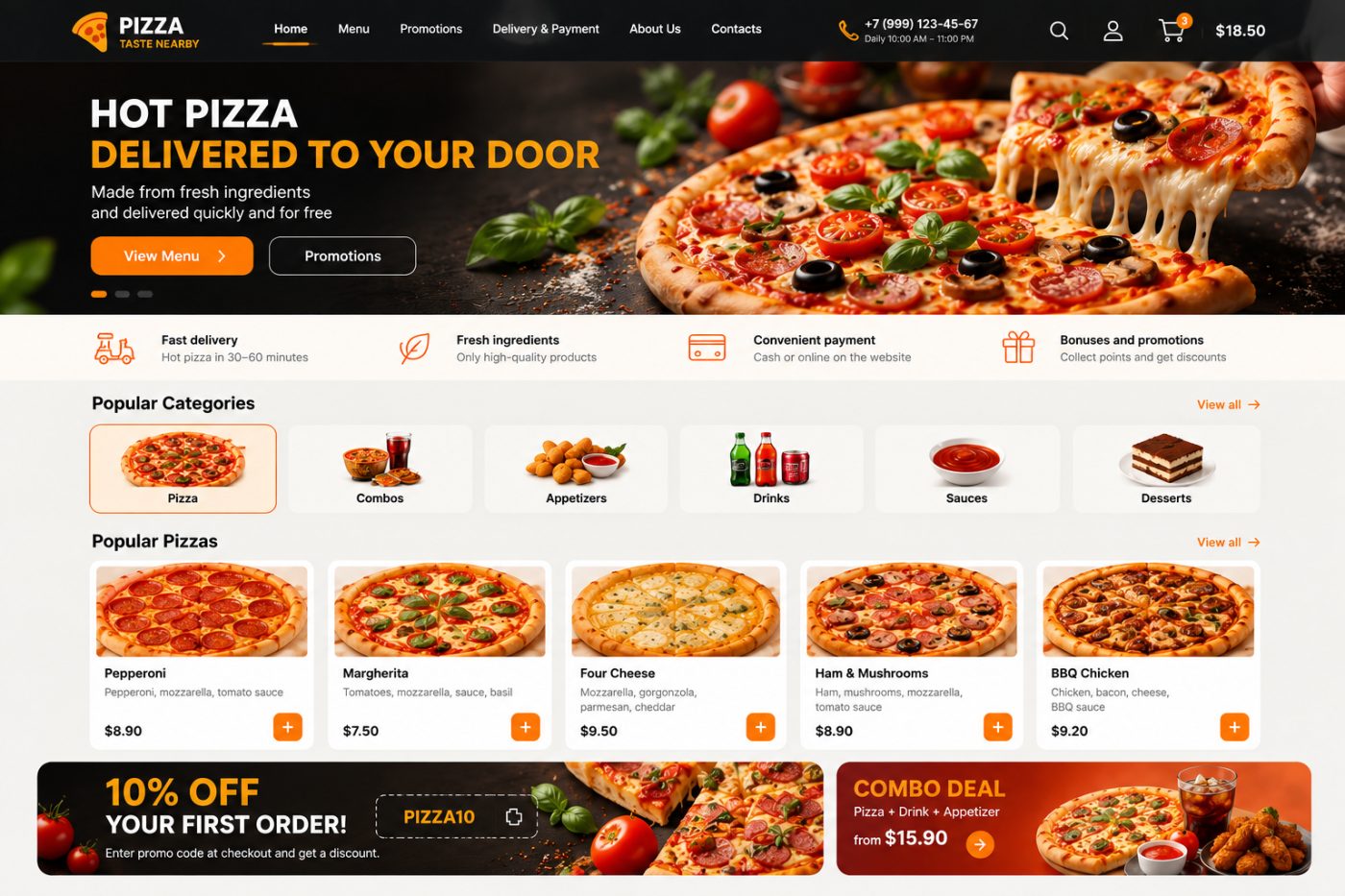
An online pizza ordering platform that allows customers to explore the menu, discover promotions, customise their orders, and conveniently order fresh pizza for delivery.
Project Overview
An e-commerce website designed to simplify online food ordering for a pizza delivery business. The platform brings menu browsing, product categories, pizza selection, promotional offers, and shopping cart functionality together in one convenient interface.
The website combines appetising food photography with a clear product catalogue and an intuitive ordering experience, helping customers discover their favourite pizzas, explore meal combinations, and complete their orders with minimal effort.
Key Features
Homepage and Promotional Banner
The homepage introduces the pizza delivery service through a large promotional banner featuring freshly prepared pizza, clear messaging, and prominent calls to action. Customers can navigate directly to the menu or explore current promotions.
Product Categories
The category section organises the menu into convenient groups, including pizza, combos, appetizers, drinks, sauces, and desserts. This structure helps customers quickly find the products they want and discover additional items to complement their orders.
Pizza Catalogue
The main product catalogue displays popular pizzas in individual product cards featuring food photography, product names, ingredient descriptions, prices, and quick-add buttons.
Customers can browse different varieties, compare options, and add their preferred items to the shopping cart directly from the catalogue.
Shopping Cart
The shopping cart provides a central place to collect selected products and review an order before checkout. The interface includes a cart indicator in the header, allowing customers to keep track of their shopping activity while browsing the website.
Promotions and Discounts
Dedicated promotional banners highlight special offers, discount codes, and meal deals. The design draws attention to limited offers and encourages customers to explore additional products or increase their order value.
Combo Deals
The combo section presents ready-made meal combinations that bring together pizza, drinks, and appetizers at an advertised starting price. This helps customers discover convenient meal options without selecting every item individually.
Delivery and Payment Information
The website includes dedicated navigation for delivery and payment information, helping customers understand the ordering process and available payment options before placing an order.
Customer Account
The header includes account access, providing an entry point for customer-related functionality and a foundation for managing personal information and order history.
Search and Navigation
A clear navigation bar provides access to the homepage, menu, promotions, delivery information, company details, and contact information. Search functionality helps customers find relevant products more directly.
Project Goal
The goal was to create an attractive and user-friendly online store that makes ordering pizza quick, convenient, and engaging.
By combining an organised menu, product cards, shopping cart access, promotional offers, and clear navigation, the website provides a streamlined shopping experience while helping the business showcase its products and encourage repeat orders.
Project Type: E-commerce Website · Online Pizza Ordering · Food Delivery · Shopping Cart · Product Catalogue · Promotional Marketing
Flowers with Love — Online Flower Shop
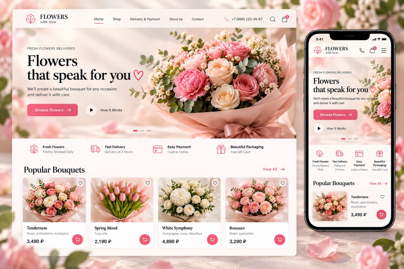
An elegant e-commerce website for ordering fresh flowers and bouquets online, featuring a curated product catalogue, convenient shopping cart, and a seamless flower delivery experience.
Project Overview
An online flower shop designed to make choosing and ordering bouquets simple, enjoyable, and convenient. The platform combines floral arrangements, product categories, delivery information, and shopping functionality in a visually appealing interface.
The website showcases a variety of bouquets for different occasions, allowing customers to explore floral designs, compare prices, select their favourite arrangements, and place orders for delivery.
Key Features
Homepage and Hero Banner
The homepage introduces the flower shop through large, high-quality floral photography, elegant typography, and a prominent call to action. The hero section highlights the shop's main offering and directs visitors to browse the available bouquets.
Popular Bouquets
The product catalogue showcases popular floral arrangements through individual product cards featuring bouquet images, names, flower descriptions, prices, and quick-access shopping cart buttons.
This layout helps customers compare arrangements and find suitable bouquets without navigating through multiple pages.
Product Categories
The website provides a structured browsing experience that can be expanded to include different flower types, bouquet styles, seasonal collections, and arrangements for special occasions.
Shopping Cart
Customers can add their favourite bouquets to the shopping cart directly from product cards. A cart indicator in the header provides quick access to selected items and supports a convenient purchasing journey.
Wishlist and Favourites
Heart-shaped controls allow customers to mark bouquets as favourites. This feature provides a convenient way to save interesting arrangements for later consideration.
Flower Delivery
Delivery information is highlighted throughout the interface, communicating the availability of fresh flowers and convenient delivery options. Dedicated navigation provides access to delivery and payment details.
Payment Options
The website highlights convenient payment methods, including cash and online payment options, helping customers understand the available purchasing process before placing an order.
Beautiful Packaging and Gift Options
Dedicated visual elements emphasise bouquet presentation and gift packaging. These details reinforce the shop's focus on delivering flowers that are ready to make a special occasion memorable.
Contact Information
The header includes a contact phone number and navigation to essential website sections, making it easy for customers to find business information and get in touch with the shop.
Responsive Design
The website concept includes desktop and mobile layouts to provide a consistent shopping experience across different screen sizes.
On desktop, customers can browse multiple bouquets side by side. On mobile, the layout adapts to a compact product presentation with accessible navigation, prominent shopping controls, and clearly visible product information.
Visual Concept
Elegant Floral Identity
The design combines soft pink tones, warm cream backgrounds, and delicate floral imagery to create a romantic and welcoming visual identity suited to an online flower shop.
Premium Product Photography
Large bouquet images play a central role in the shopping experience, allowing customers to appreciate the colours, composition, and presentation of each arrangement before making a purchase.
Refined Typography
Elegant serif headings are combined with clean, readable body text to create a balance between a premium floral aesthetic and practical e-commerce usability.
Intuitive Shopping Interface
Clear navigation, consistent product cards, visible prices, favourite controls, and prominent cart buttons help customers move naturally from discovering bouquets to selecting products.
Project Goal
The goal was to create an attractive and user-friendly online store that presents floral arrangements beautifully while simplifying the process of choosing, purchasing, and arranging flower delivery.
By combining high-quality product photography, organised product listings, convenient shopping controls, and clear delivery information, the platform supports both product discovery and a straightforward online purchasing experience.
Result
We created an e-commerce website concept for a flower shop with a refined visual identity, a bouquet catalogue, shopping cart functionality, favourites, delivery information, and responsive layouts for desktop and mobile devices.
The result is a visually engaging online shopping experience designed to help customers discover beautiful bouquets and order flowers conveniently for themselves or as gifts.
Project Type: E-commerce Website · Online Flower Shop · Product Catalogue · Shopping Cart · Flower Delivery · Responsive Web Design · UI/UX Design
Websites & web apps
We can help with a new website, an online store, a customer portal or a custom web application. Depending on the project, the scope may include structure, interface design, development, integrations, testing and launch. We agree on the deliverables before development starts.
Discuss your website